
Ellie’s Academy UX Design Case Study
The project is a part of Google UX Design Professional Certification Program
Project Overview
Summary of the Project
Ellie’s Academy is a conceptual case study in designing an education oriented app that acts as a tool to help tutor teenagers in technical skills. This app allows users to learn necessary technical skills for their career and day to day life.
Project Duration
February 2023 - March 2023
The Problem
Many teenagers are unable to attend the local technical institutes, workshops and camps due to time and cost reasons, but still want to learn the technical skills.
The Goal
A mobile app that help tutor teenagers in technical skills.
My Role
UX designer designing an app for Ellie’s Academy from conception to delivery.
Understanding The User
User Research Summary
The research was conducted by using social media to connect with and interview individuals who use mobile, tablet and desktop apps. The assumption was made going into the interview that users would like to have an app to learn courses and skills for their career and day to day life.
Pain Points
It’s unclear for users what to learn currently and going forward.
Most apps provide courses with a payment and subscription scheme which is not accessible for everyone.
The users need an option to schedule the courses.
After completing the course the users find it difficult to get a job/career according to the course taken.
Personas
Problem Statement Gopika
Gopika is a busy secondary school student who needs to acquire some new talents because she want some help with her studies.
Problem Statement Akash
Akash is a busy part-time worker who need to acquire some new talents because he wants to learn some extra skill that can help his career.
User Journey Map
Mapping Gopika’s user journey revealed how helpful it would be for users to have access to a dedicated education app for technical skills.
Starting The Design
Paper Wireframes
Taking the time to draft iterations of each screen of the app on paper ensured that the elements that made it to digital wireframes would be well-suited to address user pain points.
For the home screen, I prioritized mainly for search, featured courses and course categories.
Stars were used to mark the elements of each sketch that would be used in the initial digital wireframes for home screen.
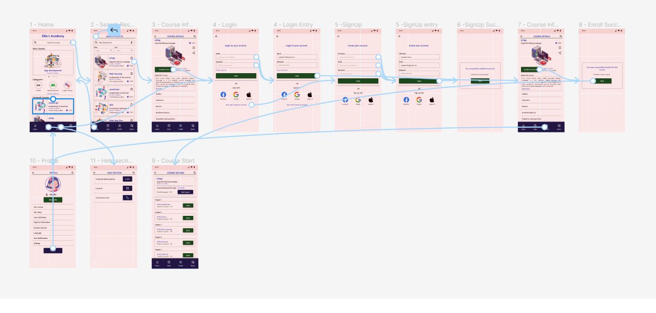
Digital Wireframes
I wanted a clean and minimal UI to provide more focus on content and functionality.
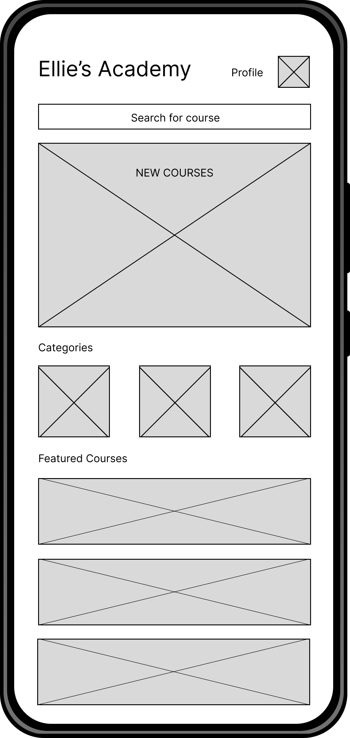
The search box is kept front and center for ease of access along with new courses, featured courses and categories etc.
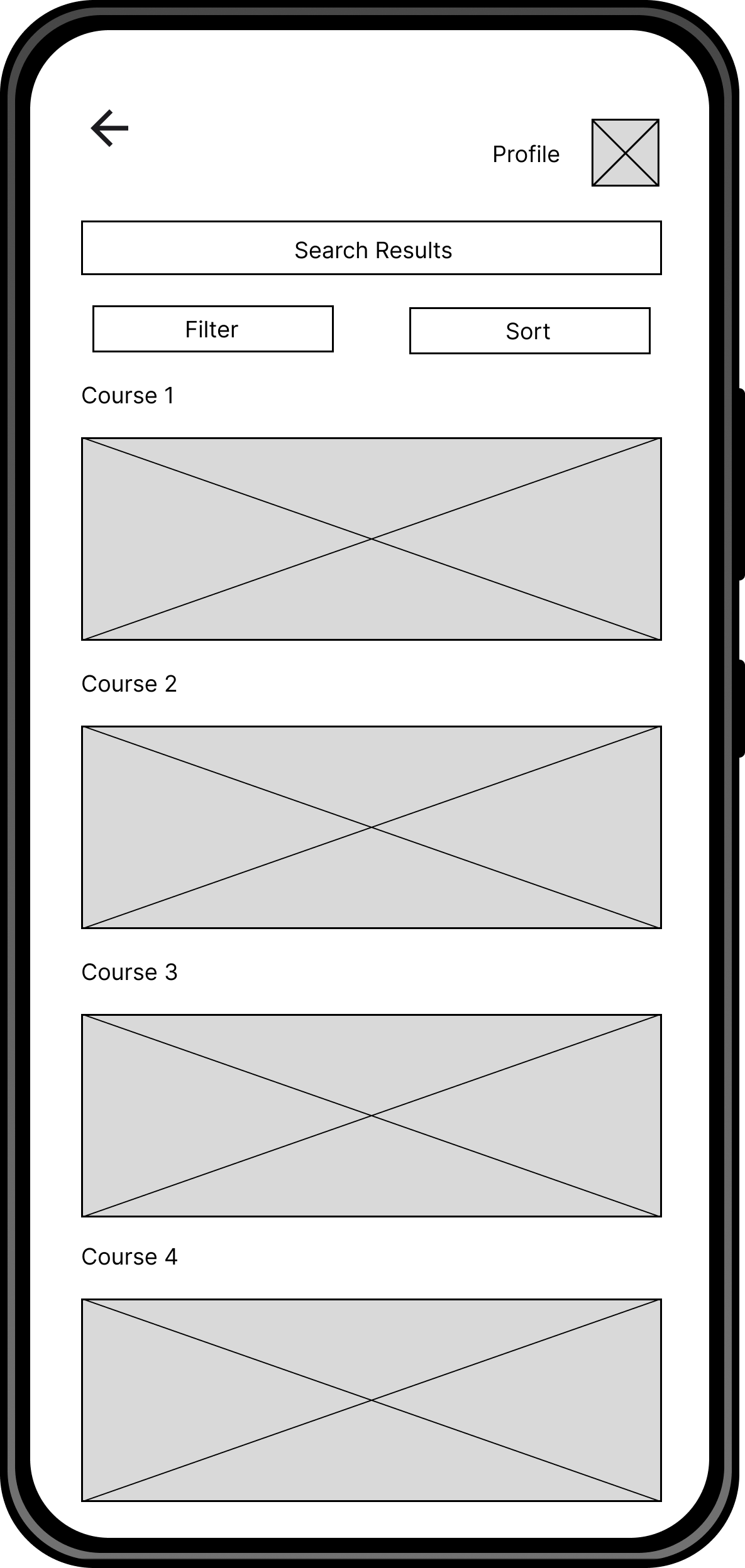
Search filter helps the users narrow down their search for the desired course.

Users are greeted with a confirmation screen pop up saying “Successfully enrolled” after enrolling for the the course.
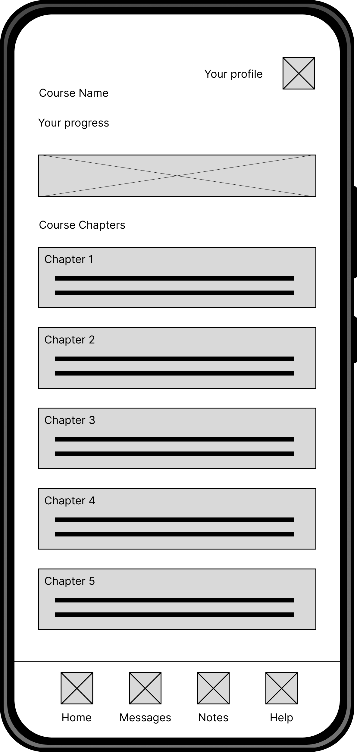
The users can track their course progress through the course dashboard.
Low-Fidelity Prototype
After making a completed set of digital wireframes, I created a low-fidelity prototype. The primary user flow I created is to enroll for a course which could be used in a usability study.

Usability Study Round 1
Findings from the first study helped guide the designs from wireframes to mockups.
Users wanted a quick access navigation bar in bottom of home page.
Login section needed a better layout and other login options.
Option to have dedicated tabs for payment, certificates, notes etc. in profile section.
Refining The Design
Mockups
Early designs had more elements some were removed to reduce confusion in navigation and provide better aesthetics.

Added a quick access navigation bar in bottom of home page.
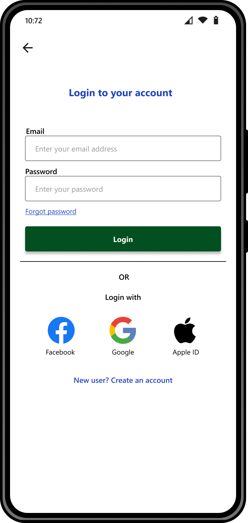
Added other login options and updated layouts.

Added separate sections payment, certificates, notes.

Course description section has been further divided into different categories.
High-Fidelity Prototype
The final high-fidelity prototype of Ellie’s academy education app presented cleaner user flows for enrolling for a course.
Usability Study Round 2
The second study used a high-fidelity prototype and revealed what aspects of the mockups needed refining.
Users wanted removal of quick access navigation bar in bottom of login page.
Users wanted to see more information about the course and its benefits.
Users wanted an option to bookmark and share their courses.
Mockup Iterations
Some updated screens after usability study.
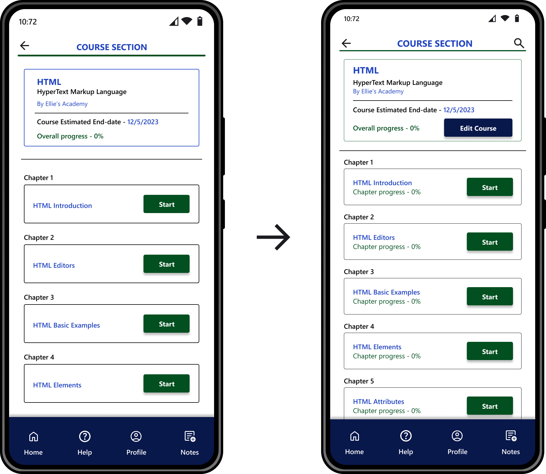
Progress status and edit course are added.
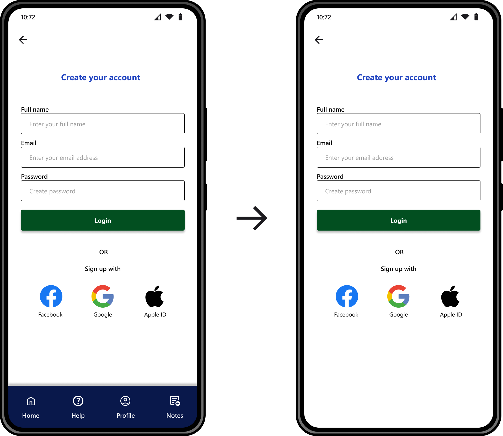
Removed quick access navigation bar in bottom of login page.
Responsive Designs

Mobile screen size
The education app was initially designed for mobile screen size. The amount of screen here is low. So the important features are added here in one screen with a clean and minimal UI.

Tablet screen size
Compared to the mobile screen size the tablet provides more screen area. Hence more content can be added here. Some elements are scaled up to match the screen size.
Desktop screen size
The desktop screen provides the most area. There is sufficient space to add a “Login/Register” button.
Accessibility Considerations
Used icons to help make navigation easier.
Used appropriate white spaces which evenly makes the content in design easily scannable and significantly improves legibility.
Used different typography sizes and spaces with text elements to highlight different types of content
Going Forward
Next Steps
Do another round of usability testing’s with a bigger group with real world conditions and iterate app functionality from feedbacks received.
Improve the accessibility of the product by testing with more people with disabilities.
Find out what other new features that can be added to existing design.
Impact
This app has made it possible to for users to enroll for courses in a short amount of time. Users can enroll for the course and continue their course with a flexible schedule.
What I Learned
I’ve learned that what I initially thought was a simple project with a few screens and basic functionality was the result of my own inexperience. As I delved into the design process and learned more about the users and their needs to project developed into something more powerful and impactful than I initially thought it could be.