
Bella’s Bakery UX Design Case Study
The project is a part of Google UX Design Professional Certification Program
Project Overview
Summary of the Project
Bella’s bakery is a conceptual case study of designing an online bakery E-commerce store for users to quickly order their favorite baked goods, sandwiches, pastry, cakes etc. The website allows users to schedule a safe and contactless in store pick-up or home delivery.
Project Duration
December 2022 - January 2023
The Problem
A local bakery doesn’t have a website for its users to order food online to be picked up or be delivered when its customers are on the move.
The Goal
A responsive website that allows users to order food from a bakery.
My Role
UX designer designing a website named Bella’s Bakery from conception to delivery.
Understanding The User
User Research Summary
The research was conducted by using social media to connect with and interview individuals who order foods online, use food ordering apps and have experience of purchasing products at a local bakery and other food shops.
Potential users for this website are busy individuals, who are on the go and do not have time to stop into a bakery risking the chance of items being sold out or not having options that cater to their dietary needs.
Pain Points
Due to their demanding schedule, working adults do not find the time to buy baked products in person.
No real time tracking available in most apps this make the user frustrated and impatient waiting for their order to be delivered.
Delivered baked products are not always fresh, deeming them unfit for consumption.
Personas
Problem Statement Kaveri
Kaveri is a busy fashion designer who needs to order cakes on the go, because she want them to be delivered to her kids at home.
Problem Statement Nivin
Nivin is a busy college student who needs to order some inexpensive fresh pastries because he wants to eat healthy on a tight budget.
User Journey Map
Mapping Kaveri’s user journey revealed how helpful it would be for users to have access to a bakery website.
Starting The Design
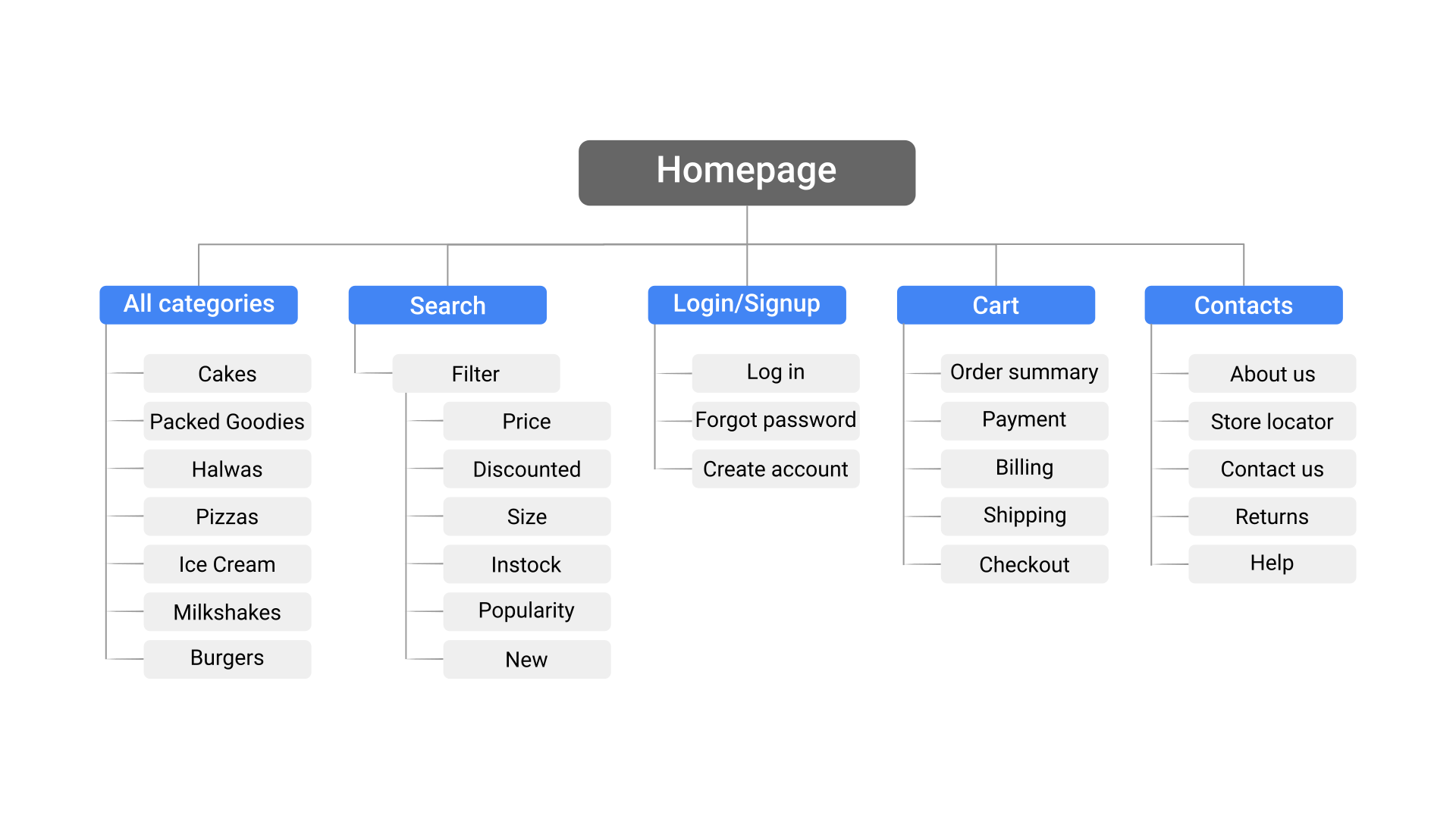
Site Map
Dividing the bakery website into different smaller sections provide better navigation. As it's a bakery website there are a lot of products of offer. So I have grouped similar products into categories and also provided necessary filters in search.
Paper Wireframes
Taking the time to draft iterations of each screen of the app on paper ensured that the elements that made it to digital wireframes would be well-suited to address user pain points. For the home page, I prioritized mainly for search, top sellers, new recipes and offers.
Since we are designing a website customers would access the site on a variety of different devices, a paper wireframe for mobile screen size of the website is also made.
Digital Wireframes
I wanted a clean and minimal UI to provide more focus on content and functionality.
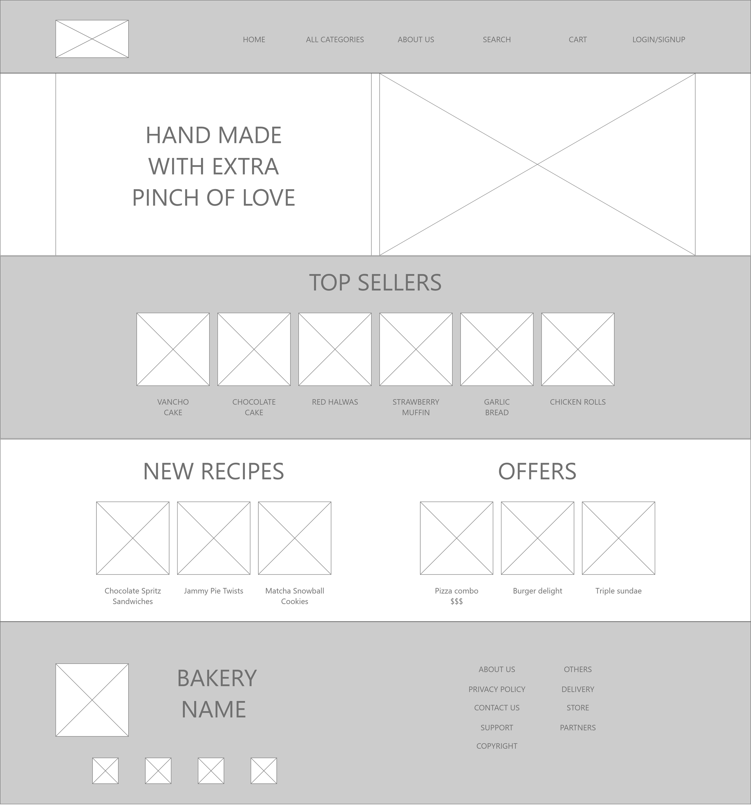
Top sellers, new recipes and offers are given more priority. A dedicated search option is also given in website.

Similar items and combos of the product are given below the product page.
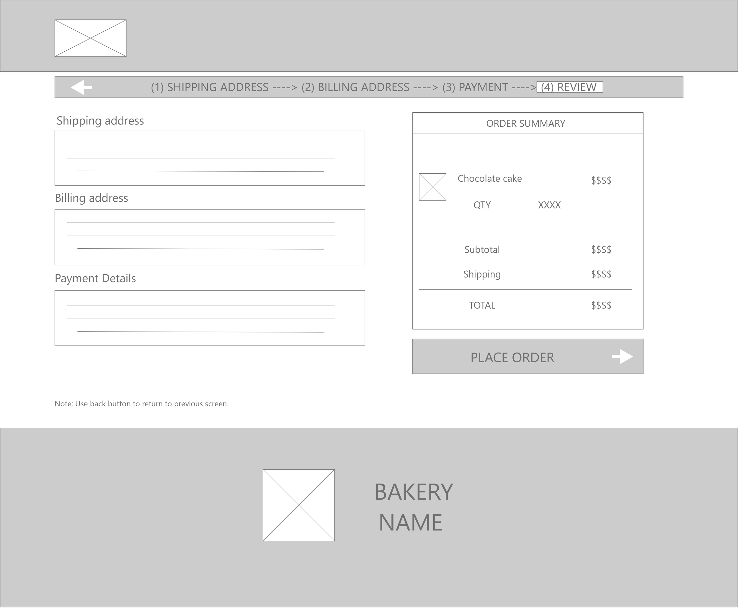
After users enter addresses and payment information they are asked to review their order before placing them.

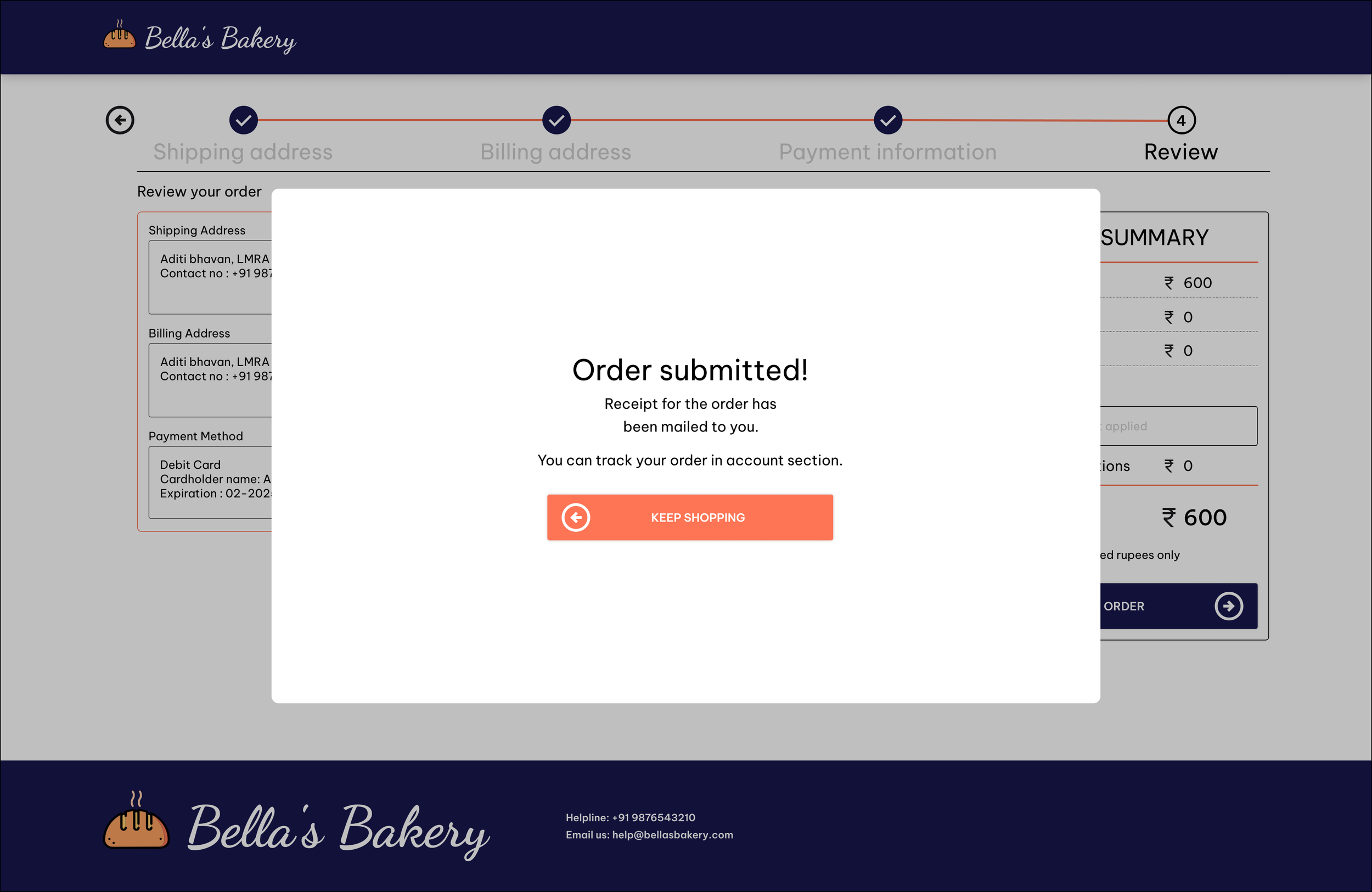
After successful completion of the checkout process the user is greeted with a pop up saying “Order submitted”.
Low-Fidelity prototype
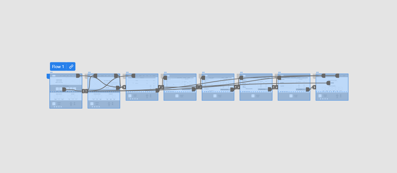
After making a completed set of digital wireframes, I created a low-fidelity prototype. The primary user flow I created is placing order for a cake which could be used in a usability study.
Usability Study Round 1
Findings from the first study helped guide the designs from wireframes to mockups.
Users wanted less clutter in homepage
Users wanted an option to quick buy the products.
Some users wanted more images of product in description page.
Refining The Design
Mockups
Early designs had more elements some were removed to reduce confusion in navigation and provide better aesthetics.

About us is moved to the footer section.

More images of the product are added.
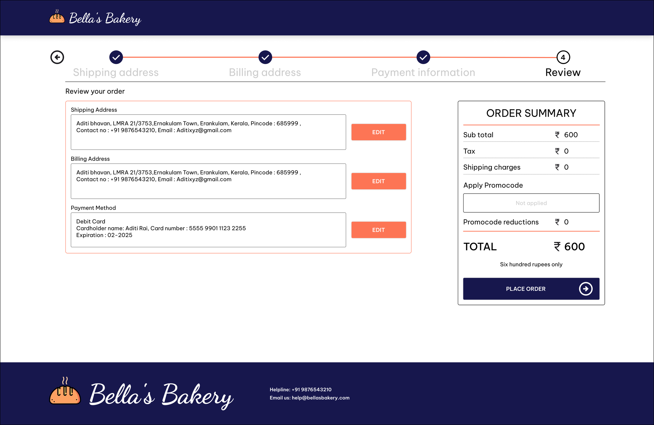
Review order page now has an edit option.
Keep shopping and similar items are removed.

High-Fidelity Prototype
The final high-fidelity prototype of Bella’s bakery website presented cleaner user flows for ordering a cake.
Usability Study Round 2
The second study used a high-fidelity prototype and revealed what aspects of the mockups needed refining.
Users requested removal of some elements in checkout process for better navigation.
An option to mark favorite products.
Guest checkout option without login in.
Mockup Iterations
Some updated screens after usability study.

Added a guest checkout option
Removed footer elements to prevent accidental clicks and better navigation during checkout process.

Added an option mark favorite items.
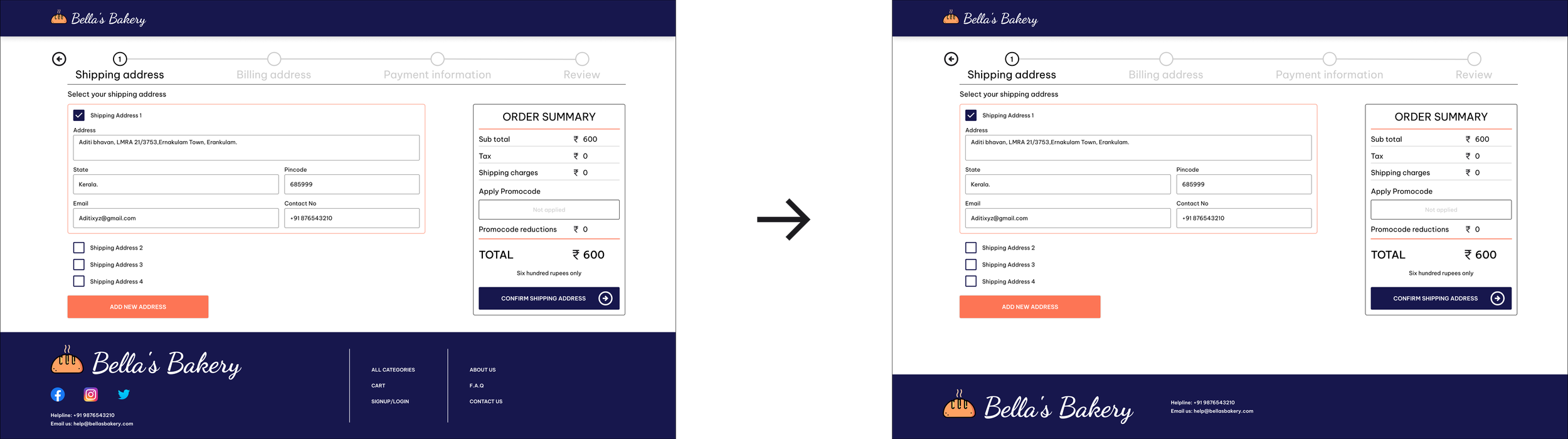
A mockup for mobile was also made as most users might access through the mobile devices. Most of the elements of the main website has been adjusted to fit in the mobile screen with as much as similar experience as they get in the main website.
Responsive Designs

Accessibility considerations
I tried to include enough information and make icons and buttons descriptive enough so that users could use this website easily.
Used appropriate contrast and tested colors so that color-blind users can easily differentiate the UI elements.
Used lots of images to accurately represent the product types.
Going Forward
Next steps
Do another round of usability testing’s with a bigger group with real world conditions and iterate app functionality from feedbacks received.
Improve the accessibility of the product by testing with more people with disabilities.
Find out what other new features that can be added to existing design.
Impact
This website has made it possible busy individuals, who are on the go and do not have time to stop into a local bakery and order food conveniently in a shorter time than before. This website also had made its associated local bakery to a engage with wider range of customers.
What I learned
I learned that even a small design change can have a huge impact on the user experience. The most important takeaway for me is to always focus on the real needs of the user when coming up with design ideas and solutions